Research Posters: Daybreakers
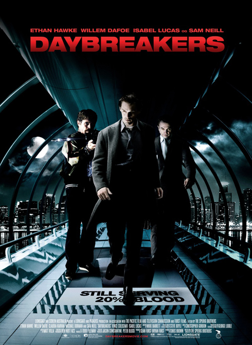
My final poster varies greatly from the previous two in terms of context as Daybreakers didn’t have any franchise or trademarks to help advertise it, as such it relied purely on who was in the film and the actual idea of the film itself. As such, the poster focuses mainly on the three main characters in the film (from left to right we have “The Mentor/Good Guy,” the main protagonist and the main antagonist) in what looks like a glass circular walkway. This changes the viewer’s perspective of the fiml as it looks like the sort of walkway that could be found being built in modern airports and train stations, but like the Death Note poster the use of a darker palette causes the brighter elements to be all the more noticable i.e. the main film title and text showing the main actors starring in the film. The use of darkness and creating a city backdrop creates the feeling of a modern and industrial setting, which to some could be considered a relatively minor detail, but the point of having a modern city that doesn’t look too dissimilar from most modern day cities is to create a sort of “Uncanny Valley” effect, as by having everything look as if it could be part of any generic Action/Thriller draws attention to the smaller details like the appearances of the characters and the carpet on the floor that says “Still Serving 20% Blood.”
All of the actors on the front look noticiably different, as both Ethan Hawke and Sam Neil (middle and right respectively) both appear to have high arched eyebrows and a paler complexion when compared to Willem Dafoe, who looks different as he’s cocking a crossbow straight towards the camera (obviously not what could be considered normal behaviour…) Unlike the previous posters this one is actually made a teaser poster that was released early before the film began its main advertising (e.g. the film’s promotional trailer) which could explain the minimalist style of the poster, as unless you count the “Still Serving…” as a tagline the poster features almost nothing in the way of text aside from what is often considered the bare essentials. Like the Dark Knight poster this image creates an almost suspiciously empty or solitude, especially for a cityscape as they are supposed to be highly crowded areas. This lack of other people or more to the point other living things at all in this poster adds to the elements of intrigue, which is essentially the entire goal of this teaser trailer. The fact that under the billing there is no indication to a date of release provides evidence for this idea, as well as the fact that the film’s website is shown in a dark red to match the title as well as stand out from the white font colour of the billing.
After researching all of these film posters I’ve come to some rather interesting points and connections to posters of this film genre, namely to advertise the posters a simple colour scheme (preferably dark or possibly even monochrome) and to have the main attraction on the protagonist/s of the film. Billing information and titles are just as important in terms of giving information out but are also not required to be in a certain place or size, just eyecatching and effective in staying within the memory of the viewer. Mystery is another important aspect, as it’s mystery that can help keep a poster within someone’s memory, intriguing them to look into more information concerning the film. As such, it isn’t necessary vital to include information like release dates or actor’s names, but it’s a feasible option too.
-
May 7, 2011 at 11:17 amEvaluation: What I have learnt through the Advanced Portfolio « A2 Media Studies: Advanced Portfolio
