Archive
Film Poster (First Draft)
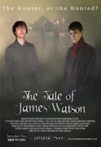
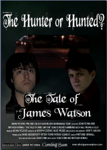
Here’s my first version of my film poster, that was made trying to follow the original planned version. It was made using Microsoft Publisher as for previous work I’ve found it useful for creating posters and other advertising. However in this case it clearly shows that it’s not up to the task of producing a high quality version of the work, as the images all look seperated instead of blending in despite my best efforts using the program. I showed the poster to my teacher and peers and they both agreed that it didn’t look like a professional poster that would be created by an actual advertising studio. The sub-title at this size is too large and overshadows the film’s title, which mislead some of the people who I showed the poster too.
I’m now working on trying to edit this and remake the poster using Macromedia Fireworks, a program that I haven’t personally used often but that has been highly reccomended by a friend who uses it for graphic design. I’ll upload the newer version of the poster ASAP.
Planning: Film Poster
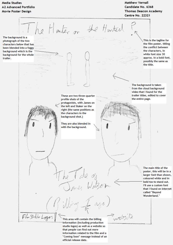
This is my design for my film poster, an ancillary task that I have to complete alongside the film trailer for the coursework (my co-worker Sean Flynn is working on the other ancillary task (to create a film magazine front cover) and will be uploaded onto the blog once he’s finished making it.)
EDIT: The original file was lost so I’ve had to upload a poorer quality version of the film poster and edited it within MS Paint to explain the reasoning behind the decisions I made.
Research Posters: Daybreakers
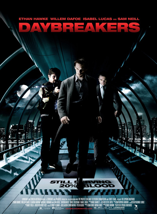
My final poster varies greatly from the previous two in terms of context as Daybreakers didn’t have any franchise or trademarks to help advertise it, as such it relied purely on who was in the film and the actual idea of the film itself. As such, the poster focuses mainly on the three main characters in the film (from left to right we have “The Mentor/Good Guy,” the main protagonist and the main antagonist) in what looks like a glass circular walkway. This changes the viewer’s perspective of the fiml as it looks like the sort of walkway that could be found being built in modern airports and train stations, but like the Death Note poster the use of a darker palette causes the brighter elements to be all the more noticable i.e. the main film title and text showing the main actors starring in the film. The use of darkness and creating a city backdrop creates the feeling of a modern and industrial setting, which to some could be considered a relatively minor detail, but the point of having a modern city that doesn’t look too dissimilar from most modern day cities is to create a sort of “Uncanny Valley” effect, as by having everything look as if it could be part of any generic Action/Thriller draws attention to the smaller details like the appearances of the characters and the carpet on the floor that says “Still Serving 20% Blood.”
All of the actors on the front look noticiably different, as both Ethan Hawke and Sam Neil (middle and right respectively) both appear to have high arched eyebrows and a paler complexion when compared to Willem Dafoe, who looks different as he’s cocking a crossbow straight towards the camera (obviously not what could be considered normal behaviour…) Unlike the previous posters this one is actually made a teaser poster that was released early before the film began its main advertising (e.g. the film’s promotional trailer) which could explain the minimalist style of the poster, as unless you count the “Still Serving…” as a tagline the poster features almost nothing in the way of text aside from what is often considered the bare essentials. Like the Dark Knight poster this image creates an almost suspiciously empty or solitude, especially for a cityscape as they are supposed to be highly crowded areas. This lack of other people or more to the point other living things at all in this poster adds to the elements of intrigue, which is essentially the entire goal of this teaser trailer. The fact that under the billing there is no indication to a date of release provides evidence for this idea, as well as the fact that the film’s website is shown in a dark red to match the title as well as stand out from the white font colour of the billing.
After researching all of these film posters I’ve come to some rather interesting points and connections to posters of this film genre, namely to advertise the posters a simple colour scheme (preferably dark or possibly even monochrome) and to have the main attraction on the protagonist/s of the film. Billing information and titles are just as important in terms of giving information out but are also not required to be in a certain place or size, just eyecatching and effective in staying within the memory of the viewer. Mystery is another important aspect, as it’s mystery that can help keep a poster within someone’s memory, intriguing them to look into more information concerning the film. As such, it isn’t necessary vital to include information like release dates or actor’s names, but it’s a feasible option too.
Research Posters: Death Note
For the coursework project as well as creating a movie trailer we also have to create two ancillary tasks. As we’re working in a group Sean and I have decided to split the work between us, with Sean working on creating the front cover for a movie magazine whilst I create a promotional poster to advertise the film. All of the posters are from films that Sean and I have researched, as I thought that it would be appropriate to use films of a similar genre to our own trailer in order to find the conventions used to advertise Action Thriller films.
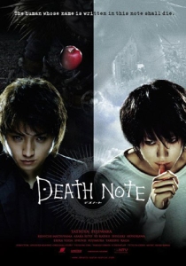
The first poster is for “Death Note” and it’s striking in using a black and white colour scheme split straight down the middle to represent two opposing forces. The two main protagonists are the main focus of the poster, with each in a specific tone representing their split views on morality. The close up of their face show both of them with a determined look, almost as if straining to try and work out something. This is appropriate as the two characters are both trying to discover the identity of the other, in order to defeat them in the name of justice. In the background there is a faded figure that is holding an apple, but unlike the rest of the poster which is divided between the black and white sides the apple he’s holding is bright red. Aside from the obvious artistic effect of bringing this to our attention (“Schindler’s List” did the same technique with a girl wearing a red coat in a very emotional scene within the film, as aside from her red coat everything else is presented in black and white, making her stand out greatly), the apple is a trademark image of the franchise and so is more a reference for fans to appreciate, showing that the film will stay true to the graphic novels it’s adapted from.
Text is used sparingly to keep the main focus on the images, although the title is stylized to be eye-catching as well as being linked to the titular notebook as the title is essentially identical to how it’s portrayed originally. What’s most interesting is how the film’s tagline runs along the top of the poster instead of below the film’s title, as this way it means that the first line you’ll probably read when looking at the poster will be that. The text is inversely coloured to stand out against the background too, allowing the division theme to work without forcing the viewer to strain to read the text. Along the bottom of the advert the film’s billing in red font, as if it was also done in alternating colours it would be too distracting and people wouldn’t have read it. Also the text is shown on a black background with the other images fading to black as the poster goes down, obscuring parts of them and adding an element of mystery to the characters, whilst again improving the quality of how the billing is presented.
All in all I really appreciate this advertisement, as it captures the idea of a conflict between the protagonists as well as making the film feel dark and foreboding, creating an element of mystery that should be integral to any good thriller film.
Research Posters: The Dark Knight
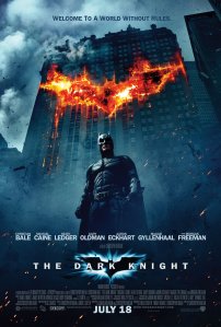
This poster is also based upon a franchise like Death Note and as such also uses imagery linked to the franchise in order to help advertise it, as well as manipulating it in order to create a specific emotion. In this poster, the bat logo that has been linked to the batman franchise since its creation is the main focus point in the background, but has been edited onto a skyscraper so it looks like an explosion has torn out a hole shaped like a bat, creating a sense of disaster and darkness as well as the obvious effect of linking explosions with violence and action. Having the protagonist standing in front of this in a high shot shows his strength and power, whilst also making him appear dark and distant from others. The fact that there is no other human on the poster other than him highlights this element of solitude.
Just below him are the names of some of the bigger stars that are featuring in the film, as fans of these actors who aren’t interested in the franchise may be persuaded to see the film if it has an actor whose work they admire. Like the Death Note poster this also has the title slightly slower than the centre of the poster, stylized so that it still retains its attraction without having to be at the top of the poster, as well as having the film’s tagline at the actual top of the page, keeping it subtle as with it being at the top of the page it is most likely to be the first thing that is read regardless. The billing is kept a subtle white colour and small font so as not to detract away from the main image, something which I agree with a lot as generally there are few people who would decide to go to a film based solely on the billing details, as such it makes sense to have them but to not overly advertise them, as if they were too large it would cause the viewers attention to be distracted from the main imagery and also wouldn’t aesthetically look as good.
I like how this poster keeps it straight forward using the branding to sell itself but unfortunately such an idea would be counter-productive for our own project, as this is supposed to be advertising a new original film, as such it wouldn’t have the benefits of owning an already well known logo or character. Nevertheless, the idea of keeping the image the main factor of the poster seems to be a crucial point to any memorable film poster.
